one hulu
X-PLATFORM + X-CHANNEL PRODUCT & MARKETING RE-BRAND


CREATE A NEW, COHESIVE, MEANINGFUL DESIGN SYSTEM ACROSS ALL HULU CHANNELS.
Hulu Product in collaboration with Hulu Marketing and British Agency DixonBaxi, got together to create a new design system for our streaming platform.
The new design unifies the Hulu experience like never before with a brand born from the origins of its name. We called it ‘One Hulu’.

Historically, Hulu Product & Marketing had always deviated in branding, creating inconsistent experiences for both our campaigns and our suite of Hulu apps for years.
In most cases, marketing teams lead the way for a brand, but we reverse-engineered this time, making sure the new design system
worked from a product implementation stand-point first. This way of thinking allowed us to vet brand ideas with engineers and if we
could realize those ideas in our apps, we knew they would work for all of the other company channels as well.
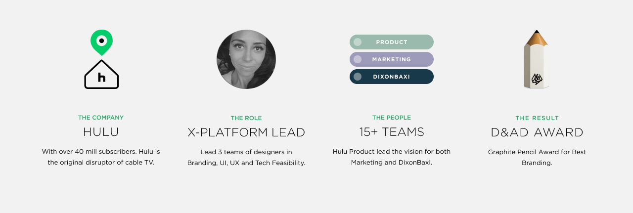
Below is a breakdown of our team and how we worked together.
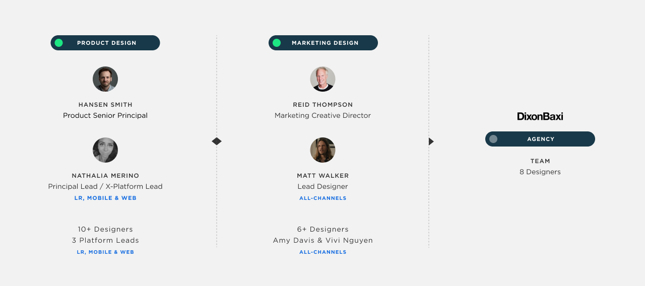

X-PLATFORM LEAD / PRINCIPAL LEAD
• Heavily influenced our brand styles
• Facilitated technical knowledge to DixonBaxi
• Shared Principal Lead responsibilities with Hansen
• Temporarily took over as the Living-room Lead
• Took over as the Mobile Lead
• Took over as the Web Lead
• Influenced creative decisions in all our platforms
• Responsible for defining the new styles for ‘Iconography & Pictograms’
• Successfully lead a team of 11 product designers and 6+ marketing designers.

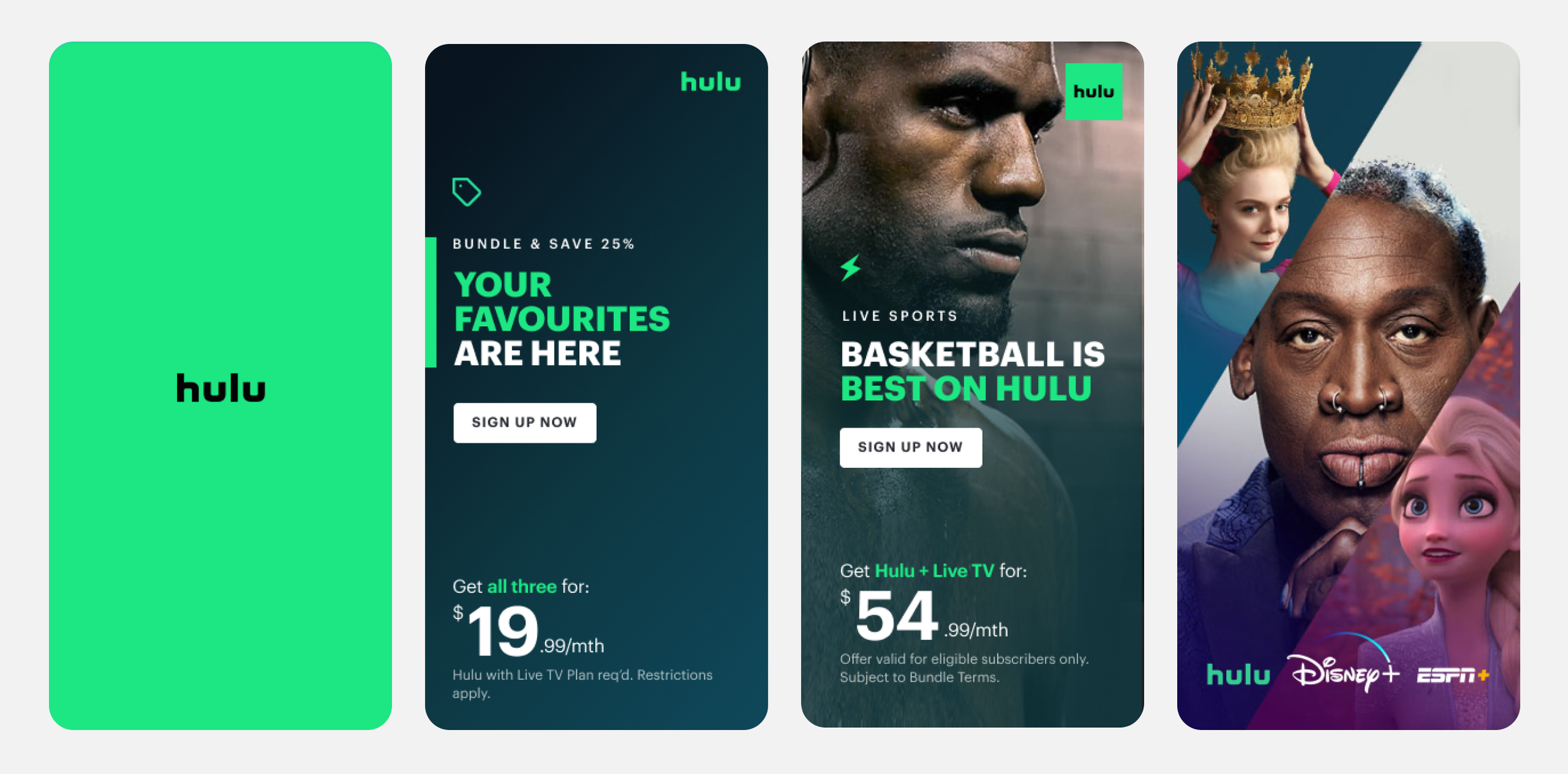
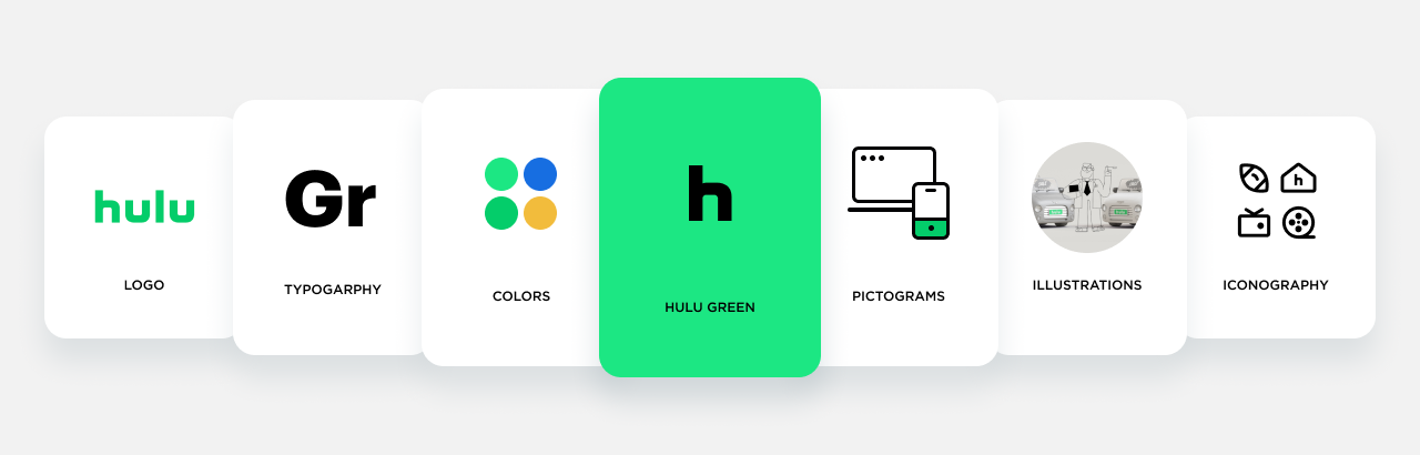
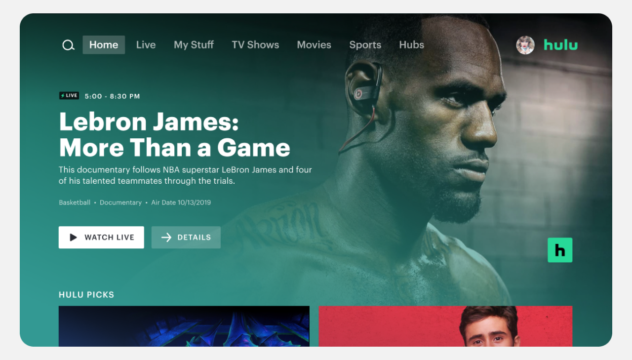
We FINALLY anchored our brand to ONE distinct green (#1CE783), and doubled-down on it to create ownership and punctuate stories.
We expanded the color palette with deeper, richer content-inspired colors – a signature detail that makes our apps distinguishable from our competitors.
To address historical inconsistencies, we created a unified suite of illustrations, pictograms, and icons. A singular font, along with defined typographic rules, was established for visual cohesion. Additionally, a versatile component and template ecosystem was developed for universal application across all Hulu channels.

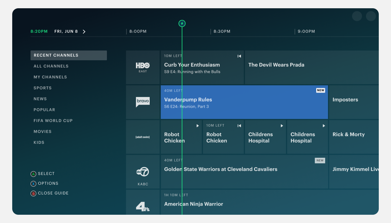
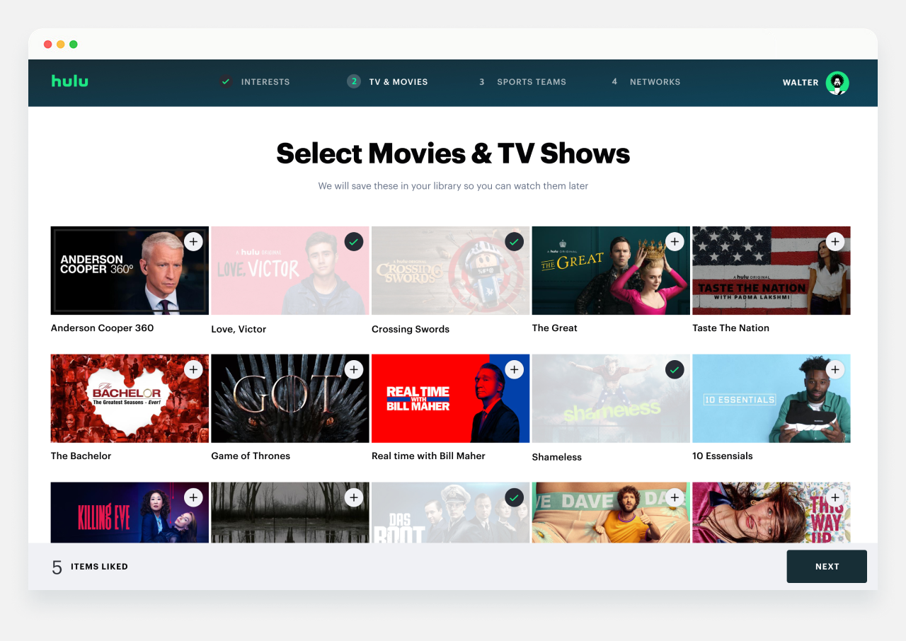
The Living-room App took center stage in our recent rebrand, given its typical challenges with implementation and role as the primary content consumption platform for our users.
Although low-powered devices smoothly handled most updates, integrating the central brand element, the 'vessel,' posed a significant UX challenge:
Making round edges on tiles, would not be possible.


The mobile app showcased exceptional refinement during the comprehensive brand update. It received a complete overhaul with new typography,
an impactful splash animation, redesigned iconography, and enhanced typographic styles. The infusion of more green, alongside
the implementation of consistent visual treatments across all components, contributed to a polished and cohesive user experience throughout the app.


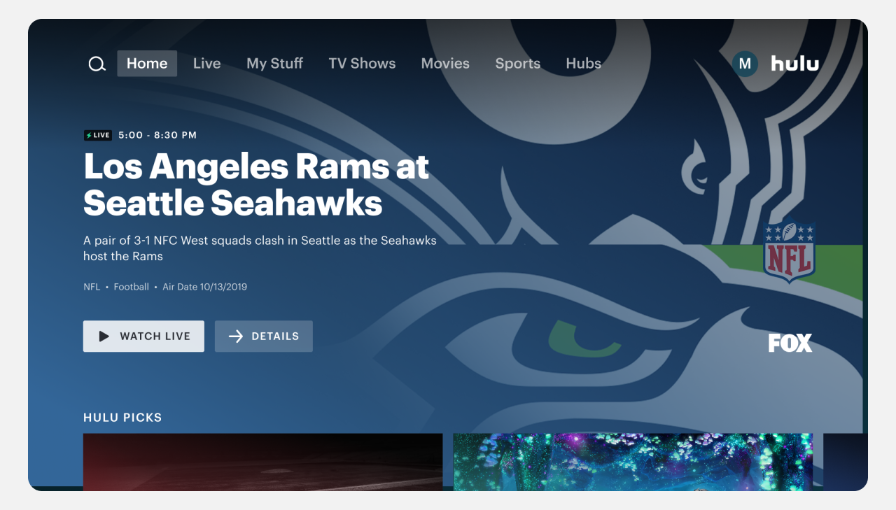
The web platform, being the final to integrate all brand updates, is currently in the process of aligning with Living-room, Mobile, and marketing counterparts.
Presented below are the envisioned designs, illustrating the anticipated alignment once the integration is complete.


Presented here are illustrative examples showcasing the potential implementation of the new design system across email
communications and one of our internal platforms—Hulu Jobs.