
design systems
LIVINGROOM + MOBILE + WEB

Since the Hulu-Disney merger in 2021, I have held diverse roles within the Design Systems Team, including Co-Principal Lead, Cross-Platform Lead,
Living-room Lead, and Mobile Lead. Notable accomplishments include playing a pivotal role in the most significant 'Product & Marketing'
alignment in Hulu's history, overseeing the Metadata cleanup across all platforms, facilitating the availability of 8 comprehensive component/template
libraries for the entire design team, and offering design feedback to feature designers and various platform leads in numerous projects.
The diagram below is not intended to convey team hierarchy in the design team but rather how we worked.
Our DS team was at the core of every part of the product experience.

This diagram illustrates the impact of the Design Systems (DS) team within the broader design organization. It is not intended to convey hierarchy.

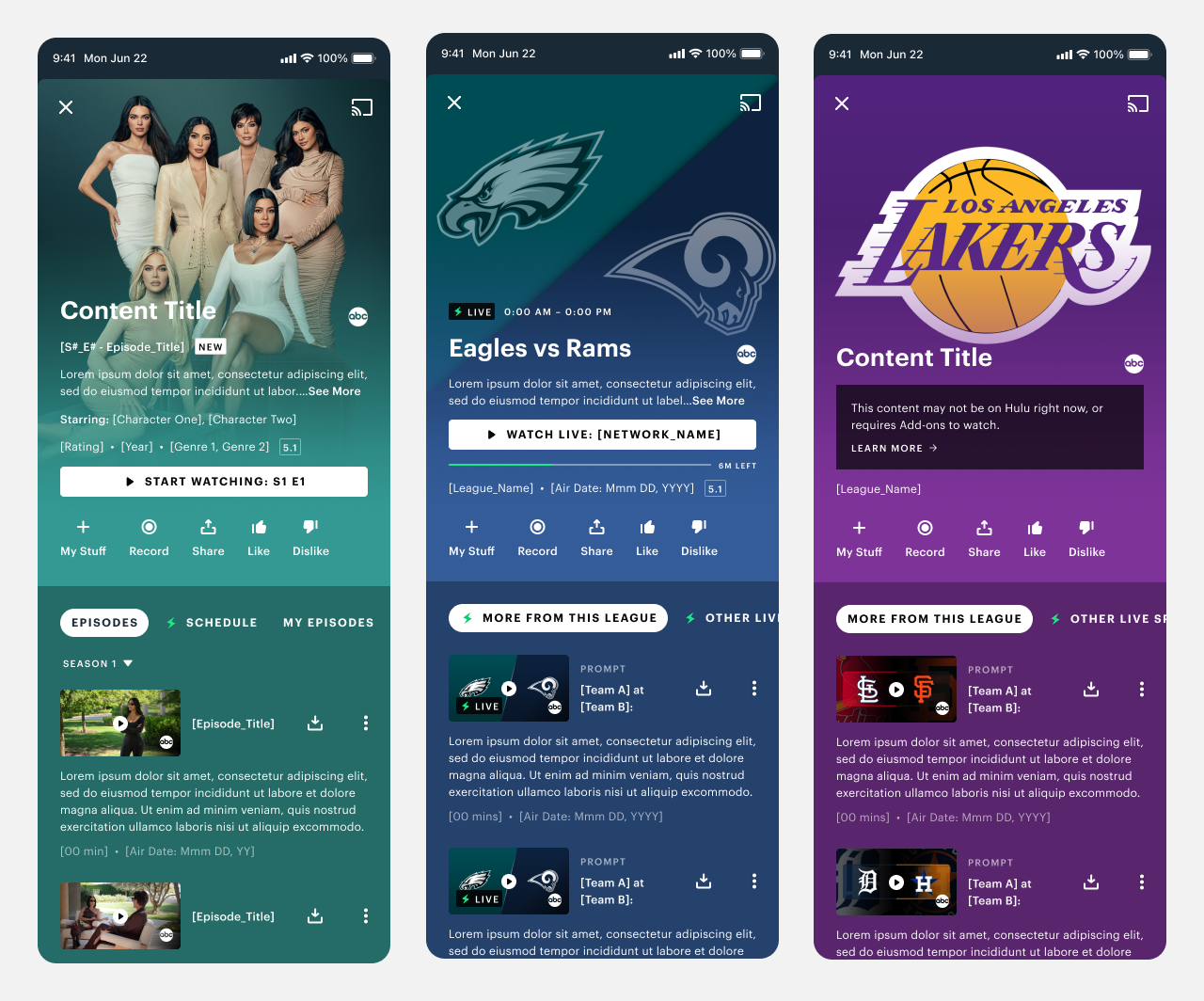
From 2019 to 2022, I self-initiated a project aimed at rectifying metadata inconsistencies across all our platforms. Employing extensive user research and testing methodologies, I addressed several aspects of our user experience. This included optimizing the order of information, rectifying truncation issues, establishing a consistent placement for components, eliminating redundancy, streamlining metadata at a home level to reduce cognitive load, and enhancing detail pages for more comprehensive information.
Additionally, I implemented character count strategies to minimize truncation, prioritizing mobile platforms for universal effectiveness. I standardized data formats for dates, times, episode information, and action text, while also devising alternative methods to convey information, reducing reliance on badging.
Finally, it also required producing meticulous documentation of a metadata matrix, capturing every conceivable user case (below).


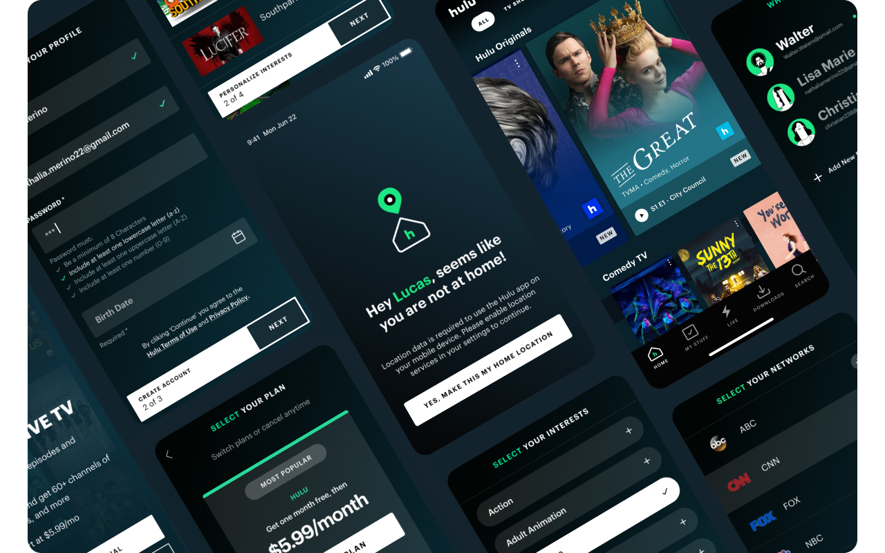
I took the initiative to lead the first comprehensive set of UI and UX guidelines encompassing brand elements, typography, colors, metadata lock-ups, badging treatments, tile styles, network logos, sponsored logos, iconography, and buttons. The objective of this undertaking was to cultivate a unified and accessible design language across all our features and platforms, thereby enhancing efficiency through the creation of well-defined and reusable components.
Noteworthy is the fact that this initiative evolved into more extensive endeavors, such as One Hulu (which included aligning with Marketing) and Muse (our online Design System).
These initiatives not only systematized our design inputs and outputs but also streamlined our processes and documentation.


Following the successful completion and launch of the One Hulu project, it was time to update all Hulu component libraries to align with the new stylistic elements.
Over an intensive 6-month period, Jamie Burnes and I collaborated closely to deliver 6 libraries: 3 for Living-room, Mobile/Tablet and Web. Plus Brand, Iconography and Pictograms.
Between the two of us, we architected a new system that not only took Hulu’s apps into account, but also, a possible unified future with Disney+ and Star, meaning the nomenclature for library structures, pages, layers, properties, states, variants, color-tokens and styles needed to be as unified as possible.
Notable mention: The work done to produce the most efficient and minimalistic expression of color tokens through immense collaboration between
our sister brands and our respective engineering teams.


Following the successful completion and launch of the component libraries (above), the next imperative was to update all Living-room, Mobile, Tablet and Web
templates to align with production and incorporate the new components from One Hulu. Over an intensive 6-month period, Jamie Burnes and I
collaborated closely, successfully delivering 4 template libraries.
Jamie took the lead on Living-room and web, while I spearheaded mobile and tablet. The comprehensive list of features encompassed Home, Account Management, Branded Hubs, Browse, Details, Downloads, Errors, Kids, Collections, Hubs, Live Guide, Log-In, Modals, My Stuff, Notifications Inbox, On-boarding, Player, Profile, Search, Welcome, Sign Up, Settings, Kids, Feature Education, Ads, Cancellation Flow, Help Center, among others.


Personal
• Biggest team that I’ve given design direction to
• Most roles I’ve ever played
• Biggest impact my work has had on a company
Company
• Met accessibility requirements for our products!
• Has global design guidelines and principles, fostering a unified brand identity.
• Shares access to a comprehensive and up-to-date component, template, & brand libraries.
• Libraries reflect what is either out in production or what’s in the middle of being developed.
• Have built a great collaborative partnership with marketing
• Won a D&AD Award for Outstanding Creative
Excellence in Branding

While I wasn't directly involved in this particular initiative, I present it to highlight the influence the 'Design Consistency Project' had in
systematizing not only our design inputs and outputs but also our processes and documentation.


