hulu LIVE ‘BOWIE’ REDESIGN
WEB END-TO-END PLATFORM UPDATE
LIVINGROOM PROMOTIONAL VIDEO USED TO INSPIRE THE REDESIGN OF ALL THE PLATFORMS.


WE HAD A ONCE-IN-A-LIFETIME OPPORTUNITY TO DISRUPT THE TV INDUSTRY & PUSH THE PRODUCT DESIGN OF HULU
INTO BEING A MORE ELEGANT, GROUND-BREAKING EXPERIENCE.
Based on the learnings coming out of the redesign of the Living-room and Mobile apps. Our objectives centered on aligning the visual design and user experience of Hulu.com, enhancing site responsiveness, addressing accessibility concerns (underscored by legal action resulting from shortcomings in the Living-room and Mobile experience), and leveraging our web platform as a strategic arena for experimentation, learning, improvement, and innovation.


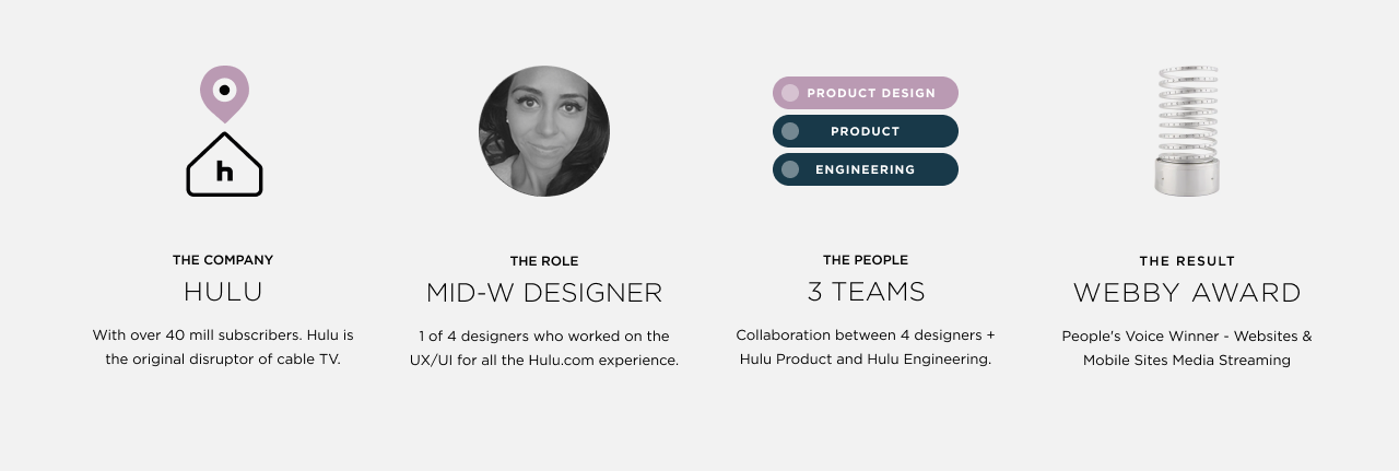
Over a span of a couple of years, teams across 4 offices joined forces to migrate 20+ million Hulu subscribers to a completely new Hulu.com experience.
Lead by our Web Director, William Faller, Product Manager, Matt Doyle, and with the help of 3 Product designers: Zac Hinton, Jess Huang and I.
The web team, under this leadership, undertook a comprehensive redesign, with a specific emphasis on crafting a live TV consumption
experience aligned with the features and content offerings available on our other platforms.
Collaborating with this accomplished team stands as a notable highlight in my professional career.


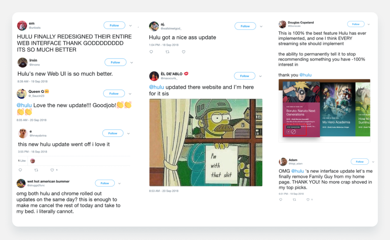
As per our user’s request and following its recognition as the most sought-after feature in the 2018 Hackathon by Hulugans, Hulu proudly introduced this capability, becoming the second streaming video service, alongside YouTube and YouTube TV, to offer users the flexibility of seamlessly switching between a dark and light interface based on the time of day. This highly-valued feature enhanced our user experience by providing a cleaner and more consumable interface during daylight with the white theme, while the dark UI offered a cinematic aesthetic and significantly reduced eye strain and glare during nighttime viewing.
An outstanding achievement in this initiative was the substantial enhancement of accessibility metrics. Commencing with a score in the low 20s, we diligently progressed to achieve a perfect 100% on Google's Lighthouse evaluation tool for the majority of the website, with the lowest-scoring page reaching 85%.


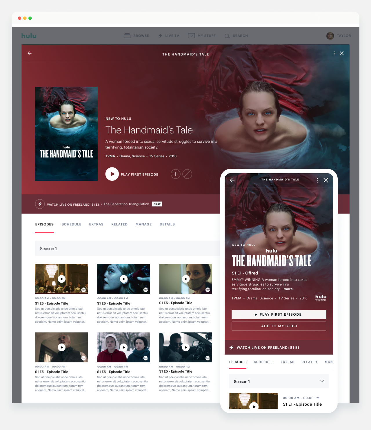
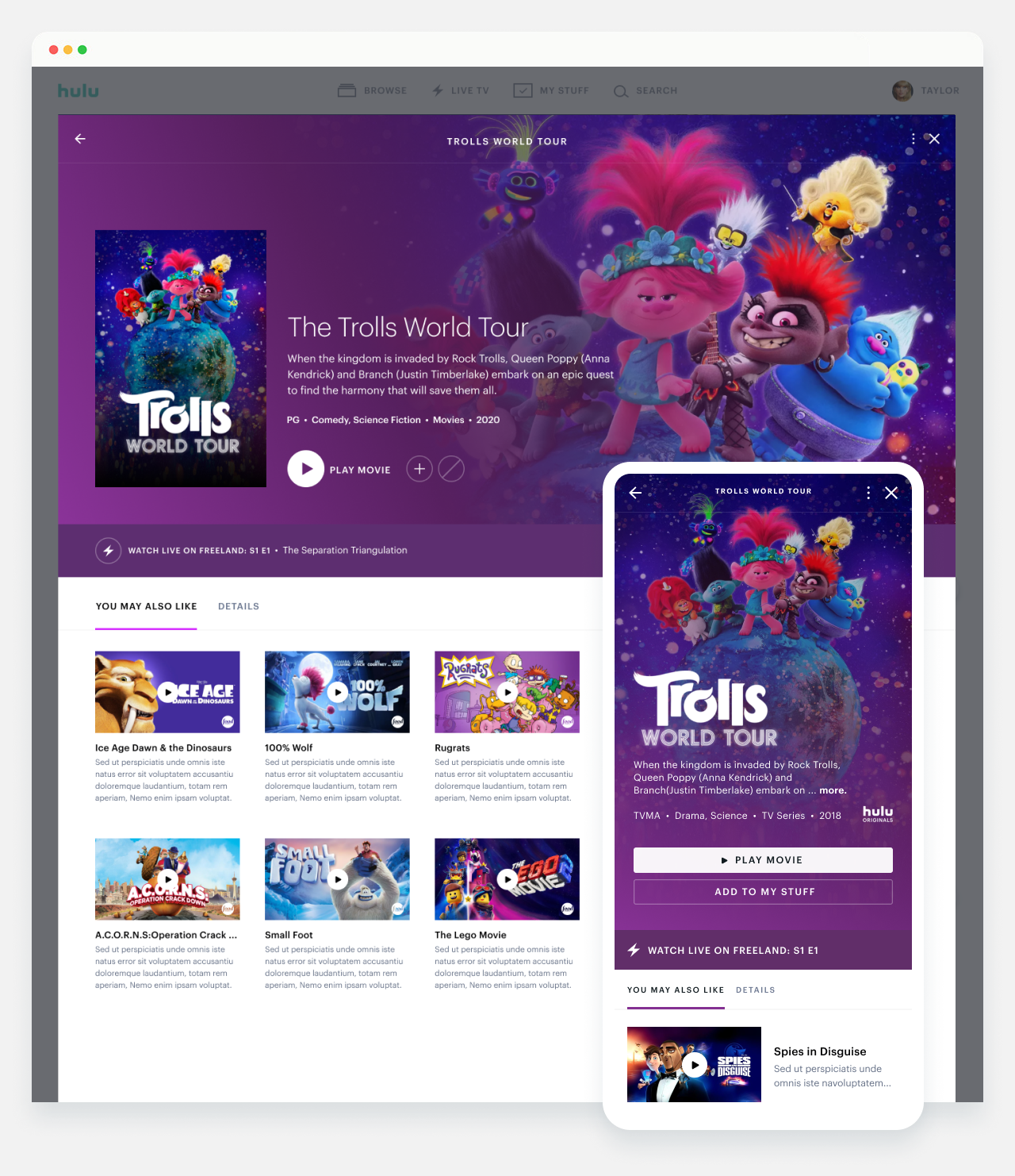
Implemented a combination of tabbed views and modal overlays. We added a back stack to modals to enable users to explore new content
while preserving their scroll position. This deliberate design choice not only fostered a clearer sense of the user's location within the app
but also enhanced overall navigation. We extended this approach to collections and hubs for a cohesive user experience.
In addition, we introduced a 'layered' approach to views, allowing users to seamlessly transition through distinct stages:
'Browse' (1st layer: Home, Search, My Stuff, Live), 'Discover' (2nd layer: Details Pages, Hubs), and 'Watch' (3rd layer: player in minimized view).
This thoughtful hierarchical structure optimized user engagement and facilitated a seamless journey through the app's content.


Launched first “Live Guide” Experience, receiving overwhelmingly positive responses from both social media and press outlets.
This success served as a catalyst, leading to the subsequent launch of similar experiences for Living Room and Mobile devices the following year.
Furthermore, it is noteworthy that channel flips, commonly known as channel surfing, were notably higher on the Web platform compared to other devices.


Lead by Jess Hui Huang, this was the most complex feature where I had the opportunity to give some design direction.
Historically, implementing minor updates to this part of the experience required navigating through multiple rounds of user testing and approvals.
A complete redesign had been deemed unfeasible for years (due to direct impact this experience had on the business's bottom line), so the pressure was on us to not only
deliver a fresh, streamlined interface but also, if possible, to enhance the overall metrics.


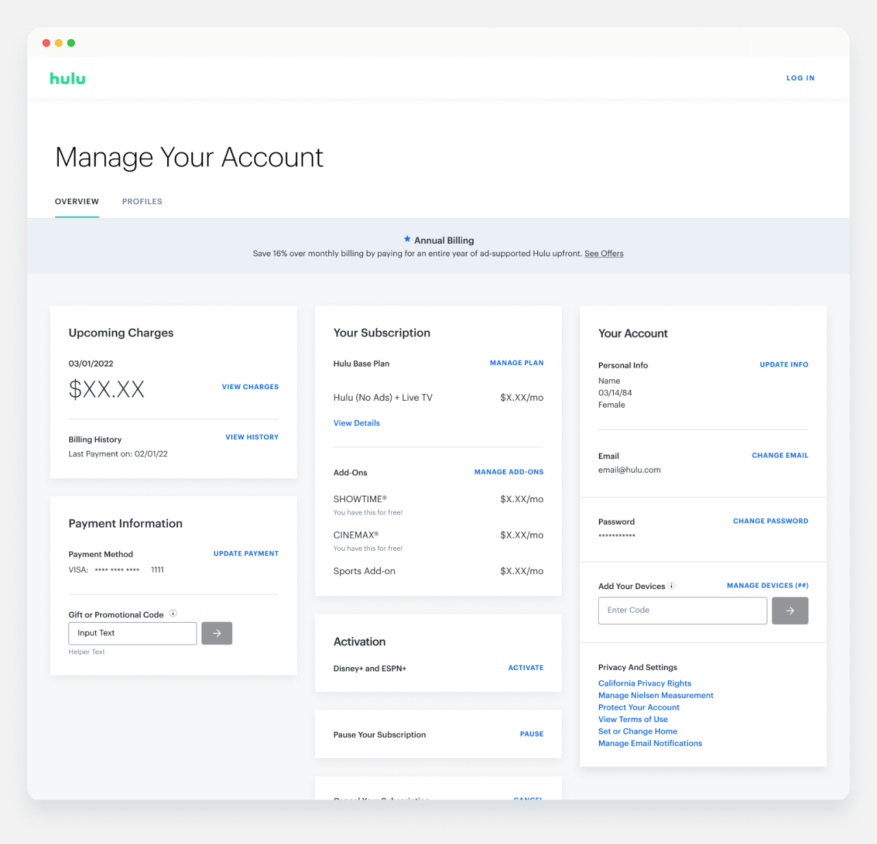
Also led by Jess Hui Huang and with design direction provided by me for 'Manage Plans' and 'Manage Add-ons',
this feature stands as the second most intricate feature of the entire website. Similar to the SUF, any minor update required multiple rounds of rigorous
user testing & approvals due to its direct impact on the bottom-line of the business.


Doubled daily unique users by +140%.
Launched first ever ‘Live Guide’, the response from users was overwhelmingly positive & paved the way for LR & Mobile devices to launch similar experiences.
Channel flips (or channel surfing) was higher on Web than any other device.
Hulu.com scored a 100% on Google’s lighthouse accessibility evaluation. Details pages scored 84%.
Lineup’s CTR increased by +1100% compared to living-room and mobile
Made the entire website responsive.
Increased active Users: +34.03% YoY 5.12M.
Successfully aligned Hulu.com with living-room and mobile from a feature and brand level perspective.
Won a Webby Award - People's Voice Winner: Websites & Mobile Sites Media Streaming